Tuesday, January 29, 2013

Brainstorming For Illustrators: 1. Free Association


Brainstorming is the problem solving activity that helps build the skeleton for an idea. It is a thought process that can occur very quickly or rather slowly. It can happen deliberately and willfully, or instinctively and automatically. It can happen by itself, as a solo string of thought activities, or simultaneously with thoughts concerning other matters.

Brainstorming is a method of creative thinking for stimulating the recollection of thoughts and experiences, for accessing knowledge that is already within your memory. Your mind is a vast warehouse, and somewhere in that warehouse are thoughts of every image, person, object, memory, and place you have ever experienced. Experiences can be first hand ones like climbing a mountain, second hand ones like reading about climbing a mountain, or even third hand ones like a friend describing scenes from a movie about climbing a mountain. For the purpose of brainstorming any can be useful, although first hand experiences are easier to recall. Some memories are clear, distinct, and immediate, while others need some kind of stimulus to be remembered. Brainstorming provides a form of stimulus using your scope of experiences to provide food for thought.

Brainstorming Techniques

Free Association

Free association is the most obvious brainstorming technique. However, it is not used as often as it should be, in fact many people do not know how to think about a problem in an open unrestrained manner. The key is to think without judging your thoughts, to think freely while maintaining an association to the problem. An effective way to do this is to think quickly. One method is to make flash cards. Create a quick thumbnail sketch or write down a word on a card, next turn the card over so you can’t be distracted by it, then move on to the next one and repeat the process. This “out-of-sight-out-of-mind” approach to brainstorming will allow you to continuously wipe your slate of thoughts clean.

Word/Phrase Listing
A subcategory of free association, word or phrase listing is one of the quickest ways to generate a body of material that can then be used individually or in combination with materials generated by using other techniques to form a practical idea. The key here is to aim for quantity, forget about quality. The more quickly you can come up with words or phrases the more likely you will draw out strong personal links to whatever problem you are thinking about.

Divorced Word/Phrase Listing
Many artists and designers will use word or phrase listing as a technique for collecting material to draw upon to generate an idea, but very few will take it a step further and use divorced word or phrase listing. As the former results in personal links to a problem, which incidentally, may be biased in one form or another, the divorced approach results in the formation of much more impersonal and less biased associations. This technique relies on a word/phrase list and here is how it works. To produce some sketches for an illustrated icon based on brainstorming an idea, I first produced a word/phrase list; below are six words taken from it.

Clouds        Brain          Lightening        Rain        Thought Bubble         Skull

The next step is to further associate using the primary words as the subject basis.

Clouds >> Sunshine                   Brain >> Neurons                    Rain >> Umbrella
Lightening >> Fireworks           Thought Bubble >> Comic Words              
Skull >> Head

It is doubtful the associated secondary word references would have been thought of without applying the divorced word/phrase listing technique. Instead of only six references, there are now twelve that can be drawn upon to create an illustrated solution to the problem.

Here are a few sketches suggested by the words.

Neuron notion. © 2013 Don Arday.
The big bang. © 2013 Don Arday.


Stormy insight. © 2013 Don Arday.
Starlight & sun sight. © 2013 Don Arday.


Tuesday, January 22, 2013

Illustration Problem Solving: A Visual Thinking Guide To Ideas


When it comes to solving problems and thinking up ideas, there has been a long running debate as to whether these skills must be an intrinsic, instinctual, “creative” talent within a person; or whether creative problem solving be achieved as a learned intellectual ability. For professional visual problem solving illustrators, designers, or artists it is a bit of both. Either way, it is a necessary requirement for anyone considering a career as a creative visual artist.

Professional illustrators usually don’t have the time or luxury to wait for that lightening stroke of inspiration to materialize a brilliant idea. Most of us have to work at it, that’s what makes illustration a profession. And just about every illustrator I know has a different way of solving a problem to complete a job. I’ve heard of many methods for getting the creative juices flowing, from taking a shower, to running in the park, to staying up straight for 40 hours, to eating pizza after midnight, to prayer, and to even asking pets for advice, seriously. All this in the hopes of getting a great idea.

When asked how he always had great ideas for illustrations, Seymour Chwast replied, “ I don’t always get great ideas, I just never show anyone the bad ones.” When animation director, Chuck Jones, was asked the same question, he replied with one word, “fear”. The fact of the matter is we all get ideas all the time about everything, and we do get ideas for the illustration projects we are commissioned. The problem occurs when it comes to the quality of these ideas we get. And, as it was for Chuck Jones, the “fear” of not being able to come up with an idea or of getting a dreaded “mental block”.

The solution is to apply a working method to solve the problem posed by the assignment and client. Understanding the process of thought that is involved with solving a visual problem can be very useful for challenging assignments.

Whether illustrators are aware off it or not, they instinctively apply many of the following stages of problem solving in the process of working on an assignment. The following is a process for generating ideas and avoiding mental blocks.

© 2013 Don Arday.

The Assignment (The Problem Stage)

Client Input
Usually a description with a collection of facts and information describing the assignment and the desired outcome. The assignment will probably be related in terms that are familiar to the client. Most likely the information will be in non-art terms and may involve marketing information and technical specifications. This is a good thing, as clients generally don't have knowledge of visual terminology. You may receive the assignment directly from the client or from an intermediary such as an art director or an account executive. Either way it won't be from an illustrator.

Reinterpretation of Client Input
To prepare for the process of “creative construction” it's necessary to translate the client's description into artistic terms that you can work with, i.e., a personal reinterpretation that applies to pictorial terms and ways of working to allow you to act on the assignment task and content. Reinterpretation will help identify any missing information the client overlooked in assigning you the job, in which case you can ask for further explanation, additional facts, or clarification.

© Don Arday.

Creative Construction (The Thought Stage)

Open Brainstorming
When you begin to think about a problem, it is important to record any and all ideas, thoughts associations, experiences, first impressions, etc. about the subject. The record of this activity may take the form of visual sketches, written words or short sentences. These will become the building blocks of further ideas. And it is absolutely critical you remain non-judgmental about the ideas you come up with, good, bad, ugly or even silly ones. Don’t disregard any ideas. Know that brainstorming is a very personal activity. At this stage the ideas generated are for you and you alone, and sometimes thoughts that are seemingly unusable may lead to ideas that are. Also, it is not sufficient to simply have the thoughts; they must be put on paper in one form or another. This process can be completed in a short period of time or it can take much longer.

Focused Brainstorming
This thought session involves searching for ideas independent of the first thought session, trying to expand the number of ideas to add to the material you already thought of to produce final sketches to present. The main difference is that this time you should relate all of your ideas to the assignment. Try to improve on your original set of ideas. Once again, try to avoid metal blocks by being to judgmental about your ideas. It's often our own judgmental expectations that stand in the way of our creative thinking. 

© 2013 Don Arday.

Research (The Education Stage)

Subject Research
One of the most interesting things about being an illustrator is all the things we learn about various subjects, in order to produce illustrations. You must familiarize yourself with the subject of your design problem. This will aid in eliminating stereotypical ideas you may have concerning the subject such as previously publicized phrases or visuals. At all times during this process you should be adding to your cache of ideas. Research is an important part of any problem solving process and should be part of your creative fee. Although I prefer to brainstorm ideas prior to researching facts, some illustrators prefer to proceed directly to the research stages before attempting any brainstorming.

Media Research
These days it is especially important to consider the media requirements of the assignment. You must become aware of the specific production processes, materials, and limitations that will influence the completion of your illustration. Budget also becomes an extremely important consideration here. This research will help you make visual and production decisions that will influence the look of your illustration. For example, a small, illustrated logo or icon will work better with a high key contrasting color scheme. Dark colors and subtle tones should be reserved for larger display formats. Also, an illustration that will appear on the web may require a different amount of detail and production resolution, than one that will be printed with a 200 line-per-inch screen on a sheet-fed offset press.

© 2013 Don Arday.

Evaluation (The Decision Stage)

Idea Review
Now it’s time to be judgmental. Idea review is the time to look for some personal benefit that might result from your choice of ideas. This is the stage where you assess all of your thumbnails and other recorded material and select those ideas you feel the most positively about. You can set your own personal criteria to judge the quality of the ideas, like which ones would enhance your portfolio, which ones will best suit your style, or make a great composition. Or you can place classifications on the ideas such as practical, attractive, unique, client suggested, etc.

Criteria Review
Consider the criteria given by the client. Re-evaluate your materials and relate them to the requirements of the problem reinterpretation. Search for unique qualities inherent in your ideas to bring attention to your client and even yourself, or ideas that may lend themselves to added benefits, such as a concept that is versatile or marketable. Criteria review is when you choose ideas that will benefit the client and cross-reference them with personally beneficial ones to choose which idea(s) to present. The idea(s) that will motivate you the strongest and you will be most excited to produce--a win, win situation.

© 2013 Don Arday.

Development (The Proposal Stage)

Idea Implementation
Now that you know exactly how you want to proceed with the assignment, obtain the specific visual references necessary to visualize your ideas. Begin the final sketch stage, all the while ironing out compositional problems. This is also the point where you should consider the actual working methods needed to produce the finished illustration that will be dictated by the sketch. It is advisable to plan out a logical schedule of action when the sketch is approved to save on time and any production answer questions the client may have.

Support Rhetoric
Sketches don’t sell themselves these days so it’s very important to provide some verbal support for your idea, whether it is spoken or written. Even though you may have provided verbal support, be prepared to justify all decisions concerning the idea and your sketch. It is not enough to be able to intuitively produce a pleasing idea. You must sell your idea clearly. The idea, in turn, will be sold again by whom ever you sell it to, especially if your client must present it to their superior or a constituent. See “10 Steps To Presenting Illustration Ideas Successfully”, posted on 12/11/12, theinformedillustrator.com.

© 2013 Don Arday.

Production (The Finish Stage)

Completion
This is the stage where approved ideas are turned into finished illustrations and prepared for delivery and commercial production, most likely, as a digitized file. All the formal visual and media considerations are finalized at this stage; media, format, size, composition, color scheme, visual elements, digital resolution, file preparation and archiving, etc.

Final Review
You are finally finished. But are you? This is perhaps the most important stage prior to the release of the finished illustration, and the one illustrators most regret not doing. Take some time to look the final illustration over very carefully and make sure you are completely comfortable with all the decisions you’ve made. I call it the 5-Minute Rule, take 5-minutes to look over the work. If something “bothers” you, then correct it. It’s the last chance.

Tuesday, January 15, 2013

Digital Printing Profiles Part 2: Practice


Profiles are resources that are available to improve the color appearance of images. Hardware and software manufacturers provide a variety of profile options to give users flexibility in controlling image color. Embedded, workspace, and destination profiles are all available and accessible.

Color Management

Programs like Adobe Photoshop, Illustrator, and InDesign provide a “color management system” that allows many options for dealing with color non-generically. Under Color Settings the user has access to Color Management Policies, Workplace Settings, and Conversion Options to improve the quality of the flow of color from internal sources that are resident in the software used to create images, to external resources that produce the final image display.

Photoshop color settings dialog box.

Working Spaces 1.

The working space designates the working color profile to be used for a particular color model.  There are a number of options are available for each RGB, CMYK, Gray, and Spot color modes. See theinformedillustrator.com post Digital Color Spaces for more information on color modes.

Color Management Policies 2.

Color management policies oversee the operation of a particular color model. They handle how color profiles are applied, the moving of color from one document to another, and they determine if there is a profile mismatch. Essentially, how the color will behave in an image. Preserve Embedded Profiles is the default provided and in most cases is the proper selection. Preserving profiles means that RGB colors will be displayed based on perceptual appearance, or how they look best in an RGB environment. CMYK colors are displayed according to the numerical values that will be needed when an image is translated for output.

Conversion Options 3.

A Conversion Engine is used to select which software to use when handling the color conversion. Adobe (ACE) is the default setting, allowing adobe program settings to be used for conversion; but the primary function involves the “rendering intent” for the colors to be converted. The Color Conversion Engine uses Intent for the handling of “out of gamut colors” when rendering colors. There are four rendering options.

Conversion engine options in color settings.
Perceptual Intent
Perceptual, the most commonly used intent, will shift both in-gamut and out-of-gamut color to generate the best visual appearance for the image. Out-of-gamut colors are brought in gamut by closest color approximation to optimize colors for improved quality results in the destination display space.

Color rendering intent options.
Saturation Intent
Saturation focuses on the intensity of highly saturated colors in an image. Color accuracy is sacrificed for visual emphasis rather than accuracy. The saturation intent is an option for situations where pseudo color is preferable to realistic color.
Relative Colorimetric Intent
A popular alternative to perceptual intent, relative colorimetric matches color to color between a workspace environment and a destination environment to preserve color consistency. Out-of-gamut colors are changed to the closest in-gamut color, even when the shift involves duplicating a color that already exists. Workspace white is matched up with destination space white.

Absolute Colorimetric Intent
In gamut colors are mapped color to color. Out-of-gamut colors are remapped to best guess, in-gamut colors. Although relative and absolute colorimetric intents are similar when it comes to dealing with colors, they differ substantially regarding white. Absolute colorimetric treats white as a color that can cause a color shift in the destination space appearance of white, which may take on a warmer or cooler look.

Black point compensation preserves the relationship of blacks between the workspace and destination spaces. Dithering allows the conversion engine to combine in-gamut colors to best represent out-of-gamut colors.

Applying Standard Profiles

Adobe and other software developers provide a way to select and apply print profiles. In Adobe it can be done in the Convert to Profile dialog box, which comes with preset profiles for many standard destination devices and print surfaces.

Convert to profiles dialog bog.
Commercial printers and digital output service bureaus will provide information as to which profile setting to use for best results with their equipment. These system profiles have been worked out with developers and tested for predictability and consistency.Hardware manufacturers provide printer profiles that are available to be downloaded from the web. Downloaded files are usually installed automatically when opened.

Detail of destination space profile options.


Using Customized Profiles

The result of producing prints on a personal printer can be much less certain than in commercial production, however there are ways to print high quality color with unsurprising, dependable results.

Custom profiles can provide even better results than profiles that are available from manufacturers. What makes custom profiles superior to generic ones is that they use your own equipment and printing paper to take readings to generate a profile. So, if your printer’s inkjets are quirky; or you prefer to use third party inks; or you use hand manufactured or exclusive material papers like bamboo or canvas; or your livelihood depends on extreme color accuracy; you will probably want to order a custom made printer profile. There are several profile companies to choose from, like greatprinterprofiles.com, owned and operated by photographer Michael E. Gordon. Each provider has different instructions and applies different methods for generating a custom profile.

Creating a custom profile print usually involves these steps:
1) Make sure your monitor is calibrated.

2) Download and print out target pages.

Sample of greatprinterprofiles test target page.
Sample of printerprofilesonline target test page.


Sample of customprinterprofiles target test page.


3) Ship the printed targets to the profiling company.

4) When received, install the provided profile into your profile directory.

5) When an image is ready to print, follow printing instructions, and print.

Custom Color Profile Providers


In The Too Much Information Category

Many profiles are classified as ICC compliant. ICC stands for the International Color Consortium. ICC profiles are those that conform to the color standards of the ICC, which was formed in 1993. Many devices are set up using ICC standards. This is essential for consistent conversion from one color space to another. ICC standards can be applied to classes of input devices, display devices, and output devices. Algorithmic models perform the transformation between color spaces, for each device class. They work for device-dependent as well as device independent color environments. Here’s how ICC works. ICC operates in a “profile connection space” or PCS space. The PCS space provides an unambiguous interface between input and output devices. The interface is either CIELAB or CIEXYZ. These interfaces are based on tristimulus or RGB color values. The CIELAB system is based on a positive-negative, or push-pull, color relationship. And CIEXYZ is based on an X, Y, Z axis coordinate relationship of colors. 

Tuesday, January 8, 2013

Digital Printing Profiles Part 1: Theory


What Is A Profile?

A digital profile is a descriptive index that is used to define of properties and limitations of a color space. A profile registry is a set of finite values that create meaning for digital display media or physical output media. Profiles exist for hardware devices, within software programs, and for physically displayed media.

What Is a Color Space?

A color space is finite set of colors that is resident within a specific color environment. Each digital environment or physical environment has its own unique color space that varies according to the data provided by a profile. A color space can be hardware, software or object based.

What Are Environments?

An environment is a device or object where a color space can be observed. Some examples of display environments include computer monitors, televisions, and IOS mobile devices such as cell phones and tablets, and digital cameras. Software programs that illustrators use like Adobe Photoshop and Illustrator are also environments that contain color spaces. And finally, an often overlooked, and chiefly important environment, is the material output devices print on, such as inkjet papers and commercial printing papers. Etc.

Hardware device profiles are typically referred to as being “embedded”; while “workspace” profiles refer to a software environment; and “destination” profiles refer to an images final display.

The Color Space Dilemma

Each environment has its own unique color space. No two types of devices, software programs, or materials are alike. For instance, any of us who have experienced placing an illustration in InDesign that was created in Photoshop, have noticed a shift in the appearance of colors. Even though the two programs are both Adobe products, each one has its own, different, “color space”, or “color mode”. And, there can be several color spaces within one software program. For further information on color spaces, see theinformedillustrator.com, September 18, 2012 post Digital Color Spaces”.

The Solution To The Dilemma

So, how can we illustrators and visual artists, know that the colors we are using in the work we are creating will be seen the way we intend them to when they are displayed in their final form? The answer is… the “profile”.

A profile acts as a translator, adjusting colors that exist in one color space for display in another. Essentially, a profile allows display spaces to talk to one and other. With a profile, an illustration or image that was created in one color space can be converted for optimal appearance in a different color environment.

Each color environment has its own unique profile. In other words, each environment has its own range of colors. For instance, the profile for an Apple iMac display is different than the profile of a Hewlett-Packard display, and the profile for an Epson 3000 printer has a different color range than that of an Epson 1900 printer. Also, each type of paper stock has its own unique profile to be used by a printer to output images. These print profiles are available directly from the paper manufacturers.

The Dilemma Created By The Solution

With each display device, software color space, output device, and final output environment in a workflow chain having a different profile; it is not unusual to end up with a profile mismatch. A profile mismatch is when the “embedded profile” does not match the working space or the destination space. A common example is when a RGB image is intended to be output as a CMYK image. By changing the RGB profile to a CMYK profile, the end result will be displayed more accurately for some destination spaces such as offset printing. It should be noted that many inkjet and dye-based digital printers prefer an RGB color space, even though they use a CMYK or CMYKRGB combination of inks to make a print. In these cases, the printer profile data has already been configured to compensate for a color environment shift.

The out of gamut color warning.

The Solution Solved

A thorough “color management system” is the solution for inconsistent color. The best results can be achieved by using a color managed workflow throughout the color display chain. Checking to make sure the proper color environments are being used from the display, to the software, to the printer, to the final output destination, can make a substantial difference when it comes to the quality of published images. 

How Do Profiles Work?

Profiles address the limitations of a color space. As the color workflow progresses through the display chain, the color space becomes more and more constricted. So, for instance, the expansive number of colors that are available for use in the RGB color mode in Photoshop has to be whittled down to fit in the output color space for web display, or printing in a CMYK color mode. In the process, a number of colors will fall out of gamut. In other words, they will be beyond the boundaries of the print color space. This also occurs in images created for other forms of display.

A comparison of the CMYK, RGB, and Visible color spaces. Grayed colors outside 
of their indexed spaces indicate they are out of gamut. © 2013 Don Arday.

An output or printer profile deals with out of gamut colors in two ways: 1) It ignores the colors. In other words, the colors are not recognized. To the printer, they don’t exist. 2) It shifts their value to make them become an in-gamut color. The profile makes a best guess alteration to the color to move it into gamut, and in many cases it assigns the color value of another similar color that already exists, collapsing two colors, or even more, into one.

Profiles Profiled

There are as many different profiles as there are; software programs; color spaces; output devices; and display spaces, regardless if they are digital or hard copy. So, the best visual results, and intended color consistency, is achieved by using profiles that were created for their respective destination environments. If not resident in the computer hardware or software being used, these specific profiles can be downloaded from the manufacturers websites. And in cases where profiles are not available, there are companies that can create customized profiles for nearly any situation.

Tuesday, January 1, 2013

IOS Color Apps For Illustration


There are OS digital color widgets, extensions and software programs, but there are also some great IOS digital color apps. And in many respects, some of the IOS apps may be more useful for illustrators and designers who prefer a certain kind of interface or need a specific functionality, along with the need for portability.

Color Chart 3

Back before there were computers or software available to provide production assistance to illustrators and designers, when they needed to choose process colors to simulate solid ones, printers would provide screen tint swatch books. These books were very expensive to produce and were coveted by anyone who could get their hands on them. Color Chart 3 duplicates the look of these screen tint books, but brings the selecting of colors into the digital age. The ability to see all tonal variations of a combination of two or more process colors is extremely useful. It is essentially a dictionary of CMYK colors. Selecting a color block will display HSB, RGB, and CMYK values that can then be used in other digital programs.

Chart for magenta and yellow color mixes.
Chart for cyan and magenta color mixes.

Single color display with numerical values.
Web, RGB, HSB, and CMYK values displayed.

EyeDrop.me

EyeDrop.me is a smartly designed app for picking, editing, and saving color swatches on IOS devices. The app will detect colors from a website’s style sheet, or a photo. Colors can be selected with an eyedropper and added to custom palettes. EyeDrop.me displays all possible colors from the website or photo you used, and the app will keep a history of the websites used to detect colors. Swatches can be custom named and edited by changing the RGB values.  The results can then be sent to Adobe Photoshop or Illustrator. An email formatted in HTML or ASE with the chosen colors can also be sent for further use. The intuitive app interface is well designed both aesthetically and functionally.

Type URL or select a photo to be analyzed.
Colors detected on theinformedillustrator.com.

Photo of flower color analyzed.
Selected color with RGB & web color values.

HueVue

HueVue is an app that was created to help colorblind people identify, match and coordinate colors. Any photo or image can be used to; provide detailed color information; display various color blindness conditions; simulate the appearance of color vision limitations; compare and coordinate colors; and manage a color library collection. For illustrators and designers, HueVue provides a very unusual color identification tool. A picture taken with the camera or an image from your library can be analyzed by touching a portion of the image. In addition to displaying an image to show certain types of color blindness, HueVue also has unique features designed to assist with color coordination and color matching.

HueVue displaying normal vision of photo.
HueVue simulating red color blindness. 

Display of favorite colors chosen from photo.
Fully editable color detail from favorites.

Color Companion

Color Companion is a multipurpose digital color app that offers a wide variety of functions. It can; analyze colors with a color tester; convert color values for web use; create palettes from images or websites; perform additive or subtractive alterations by degrees on color swathes; and store custom palettes. Color companion also provides a color wheel for non-image color selection. It offers the option of applying color theories, such as analogous, complimentary, tetradic, etc. based conditions, to alter color schemes. The color information is provided for RGB, CMYK, HSB, HEX, and Lab color spaces. Color Companion also provides a library of 50 color palettes that can used and edited in lieu of creating a custom palette. The comprehensive capabilities of Color Companion make it an excellent choice for illustrators and designers who use IOS apps to aid their OS digital work.


Home screen with color selection wheel.
Website linked and ready for analysis.

Individual color identification cursor.
Color alterations. In this case color inversion.

Selection options for creating a palette.
Display option for results of palette selection.

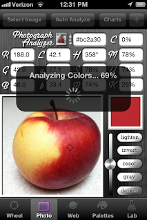
Colors analyzed from this photo of an apple.
Results of colors detected in the apple photo.


Other Apps

Some Mac OS apps and widgets and versions of Adobe extensions are also available in Apple IOS format, like Adobe Kuler, which is called Saturation. Others include ColorSchemer, Color Guide, etc. Although similar, OS apps and IOS apps vary in functionality to accommodate the differences in the operating systems.

For more information on digital color widgets and Adobe extensions, see “Digital Photoshop Color Aids”, and “Digital Color Aiding Free Widgets”.